So... The school year's almost over, huh?
So, going through things that would make a terminator cry, we've made it through another year at CMS. And there's no way I could've made it through the whole year without a certain few people: my friends. :)
As a thanks to them, I focused my multi-medium independent art project on my friends. And they better be grateful, since the mediums I used were:
- Oil Pastel, which practically killed all of my pens before I used colored pencil to write on it
- Watercolor, which created random splots of paint on it where it shouldn't be
- Friendship bracelets, which took a pretty long time to make
- Papers, which took a long time to cut out
- Rocks covered in gold foil (IT'S NOT CANDY. DON'T EAT IT)
- Negative strips, which kinda failed so I said, "Nevermind..."
- Photographs (obviously), which [at this point] have still not been developed yet.
- And ribbons. I actually have no complaints about this one.
Personally, though, I like multi-media projects since I'm not that good at drawing. It's pretty fun.
I'm also thinking of doing a second one based on "Nature" as my theme, since I take a lot of environmental photos, but I'm not sure if I would have enough time to finish.
Ah well. Wish me luck!
- Rosa
Tuesday, June 14, 2011
Tuesday, May 17, 2011
5/17/11 - Pop!
If you have never blown bubbles before, let's take a second to mourn the childhood you never had.
If you have, then you should know that the bubbles make really nice colors. So they make good photos. If you search it up on Google, you can find photos of bubbles that look like planets, some that are half popped, and a whole bunch of other cool ones! :)
So here are some taken and edited by yours truly:


 |
| It was just to cool to resist. |


 |
| Admit it. You totally thought "Aladin" when you saw the text. |


 |
| Bubbles lens! :) |

 |
| Prettay colors! |


 |
| Planet creepy. |
Hope you liked them! :)
- Rosa
5/17/11 - Minis!
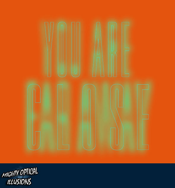
Have you ever looked at something from afar, thought it was one thing, then came closer and saw that it was completely different? Like an optical illusion.Try looking at these two optical illusions from close up. Then get out of your seat and look at them from 3 meters away. :)
Pretty cool, huh? Depending on how close/far away you are from something, it can either look very fake or very realistic. So, we've been working with toys and making them look realistic. Using miniatures, you used different distances to make them look real. Here's some photos we took:


Hope you liked them (even though they kinda failed)! :)
- Rosa
| Your mind = blown. |
 |
| Albert Einstein = Marilyn Monroe! |
Pretty cool, huh? Depending on how close/far away you are from something, it can either look very fake or very realistic. So, we've been working with toys and making them look realistic. Using miniatures, you used different distances to make them look real. Here's some photos we took:


Hope you liked them (even though they kinda failed)! :)
- Rosa
5/5/11 - Unphotoshopped Photoshop Photos
CINCO DE MAYO! Hahaha.
So... We've been working with forced perspective photos lately. Have you ever seen optical illusions? This is kind of like that.
Here's a little experiment: Hold your thumb up. At a certain distance from your face, you should be able to block out a whole person (even though that person is probably bigger than your thumb). You know why? Because your thumb is closer to your eyes than that person. Obviously. The farther away that person/object is, the smaller they look. The closer that person/object is, the larger they seem.
When used in photography, it's called Forced Perspective Photography. It can make it look like a photoshopped picture: unrealistic. Except it's real. Its just a little trick. Here's some taken by yours truly:
Hope you liked them! Note: no one was (extremely) hurt in the making of these photos. :)
- Rosa
So... We've been working with forced perspective photos lately. Have you ever seen optical illusions? This is kind of like that.
Here's a little experiment: Hold your thumb up. At a certain distance from your face, you should be able to block out a whole person (even though that person is probably bigger than your thumb). You know why? Because your thumb is closer to your eyes than that person. Obviously. The farther away that person/object is, the smaller they look. The closer that person/object is, the larger they seem.
When used in photography, it's called Forced Perspective Photography. It can make it look like a photoshopped picture: unrealistic. Except it's real. Its just a little trick. Here's some taken by yours truly:
 |
| This one kinda failed... Oh well... |
 |
| A picture where no one gets hurt! If you have no clue what I'm talking about, scroll down. |
 |
| Exactly. |
 |
| Again. |
 |
| And again. |
 |
| And again. |
 |
| And again. |
 |
| And AGAIN. |
 |
| Here's another non-painful one! :D |
 |
| Then back to pain. :) |
Hope you liked them! Note: no one was (extremely) hurt in the making of these photos. :)
- Rosa
4/26/11 - Mosaic
Have you ever put a jigsaw puzzle together? You put small pieces and pictures together to get a larger, completely different picture.
For the last week or two in photography, we've been working on mosaics. We took pictures of certain colors that we needed for our mosaics (simple mosaics are the easiest, but I had to make mines a whole lot more complicated just 'cause). Then we edited them on picnik (or, in my case, cheated: all you have to do is tint it the right color) to get them close to the same color.
From there, we had the photos developed and cut them up into the stuff we needed. Since I have no photos of my actual mosaics, here are some other ones I found:


Hope you guys liked them! :)
- Rosa
Tuesday, April 26, 2011
4/13/11 - Color Wheel
Ah, colors. A simple yet vital part of photography. Everyone is familiar with the primary colors: red, yellow, and blue (if you are not, then you obviously haven't gotten a kindergarten diploma). Then comes the just-as-familar secondary colors: orange, purple, and green. THEN comes the mix of secondary and primary colors. So it pretty much ends like thus.
- Red
- Red-orange
- Orange
- Yellow-orange
- Yellow
- Yellow-green/lime green
- Green
- Blue-green/teal
- Blue
- Blue-violet
- Violet
- Red-violet
Basically, certain colors complimet each other. they're the colors that are opposite each other on the color wheel. So: red compliments green, red-orange compliments blue-green, orange compliments blue, and so on and so forth.
 |
| Text: A strong, fierce red |
 |
| Text: An eye-catching red-orange. |
 |
| Text: A conspicuous orange |
 |
| Text: A friendly yellow-orange |
 |
| Text: A bright, welcoming yellow. |
 |
| Text: A light, playful lime green. |
 |
| Text: A clear amd crisp green. |
 |
| Text: A cute teal. |
 |
| Text: A calming yet joyful blue. |
 |
| Text: A cool blue-violet. |
 |
| Text: A calming violet. |
 |
| Text: A warm red-violet. |
Subscribe to:
Comments (Atom)